Why and How

Thoughts about process, media and meaning.

COLOR STUDIES- an experiment

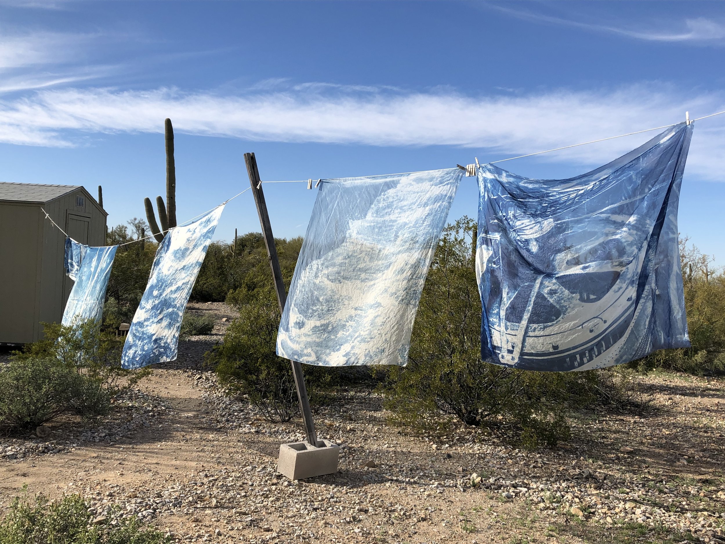
Photographs are constructs that give the illusion of documentation. Early photographic processes like cyanotype were invented specifically to produce images that were faithful reproductions of people and places. Hand-coloring of monochrome images evolved in tandem with early photography to enhance this realistic effect. Photographs have essentially been used as evidence to prove a certain reality. But at each step of the process, the photographer manipulates light and shadow, and decides what to include in the frame and what to selectively omit. What results is a subjective impression of the real.


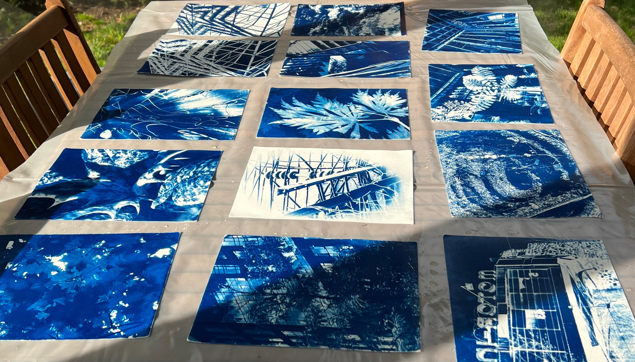
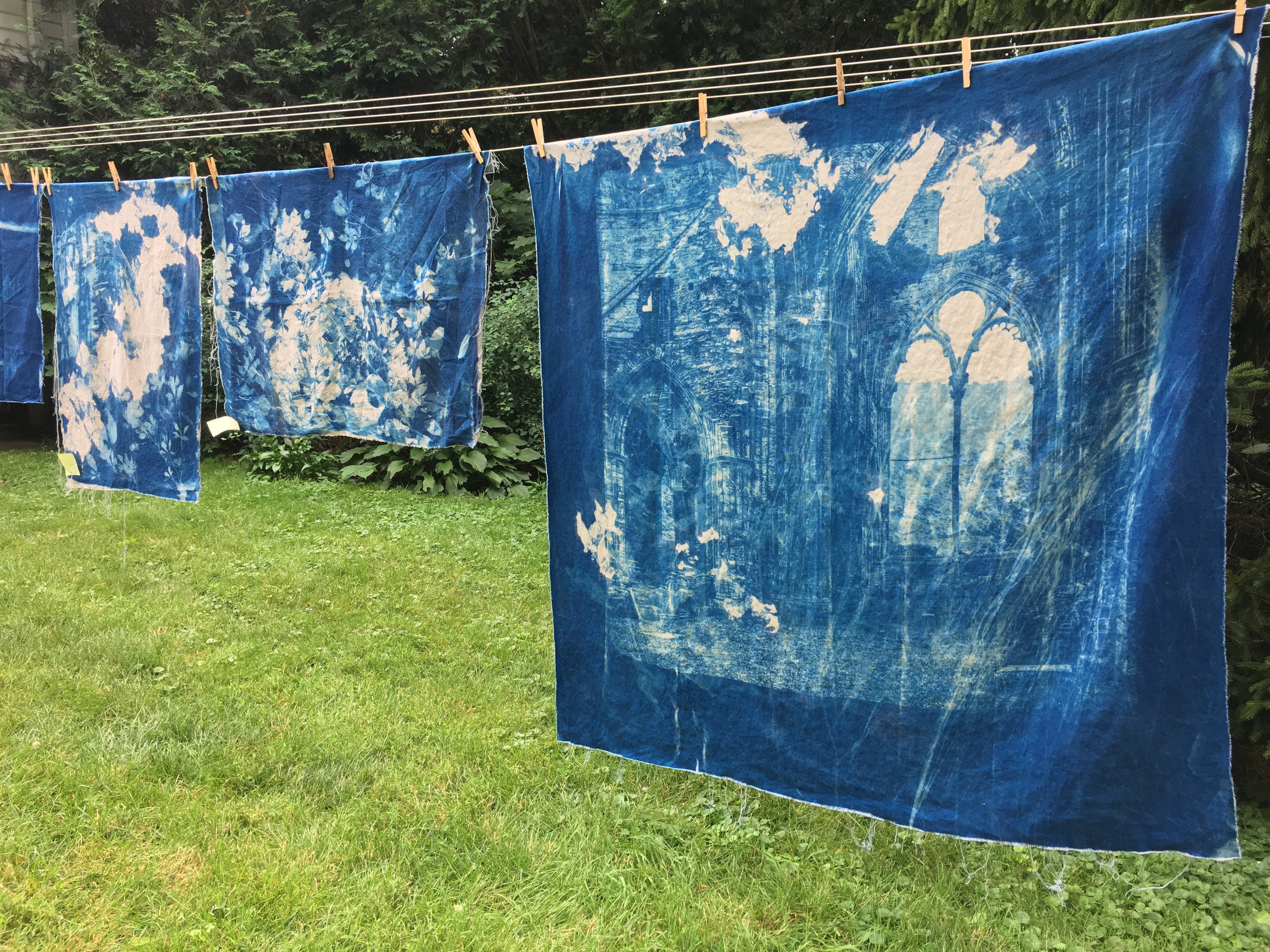
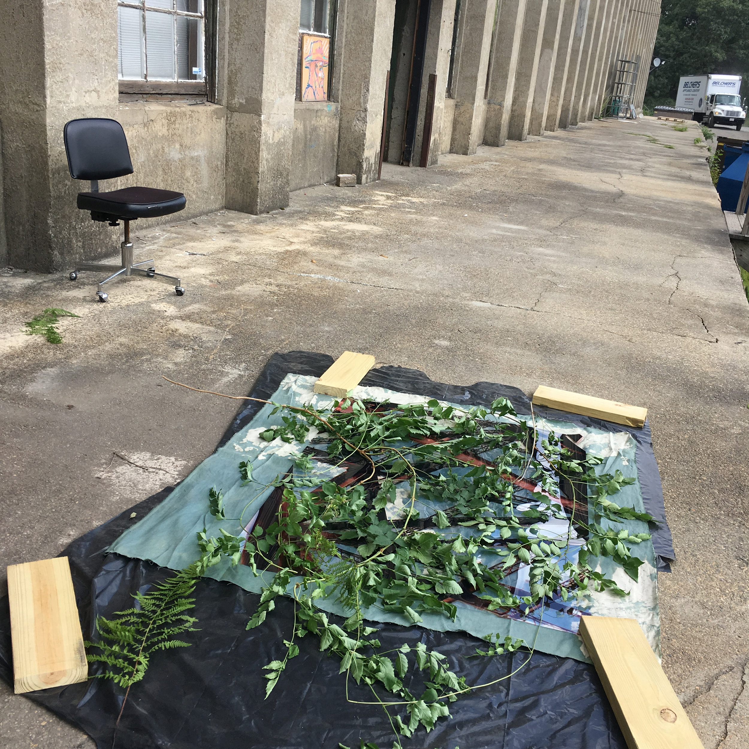
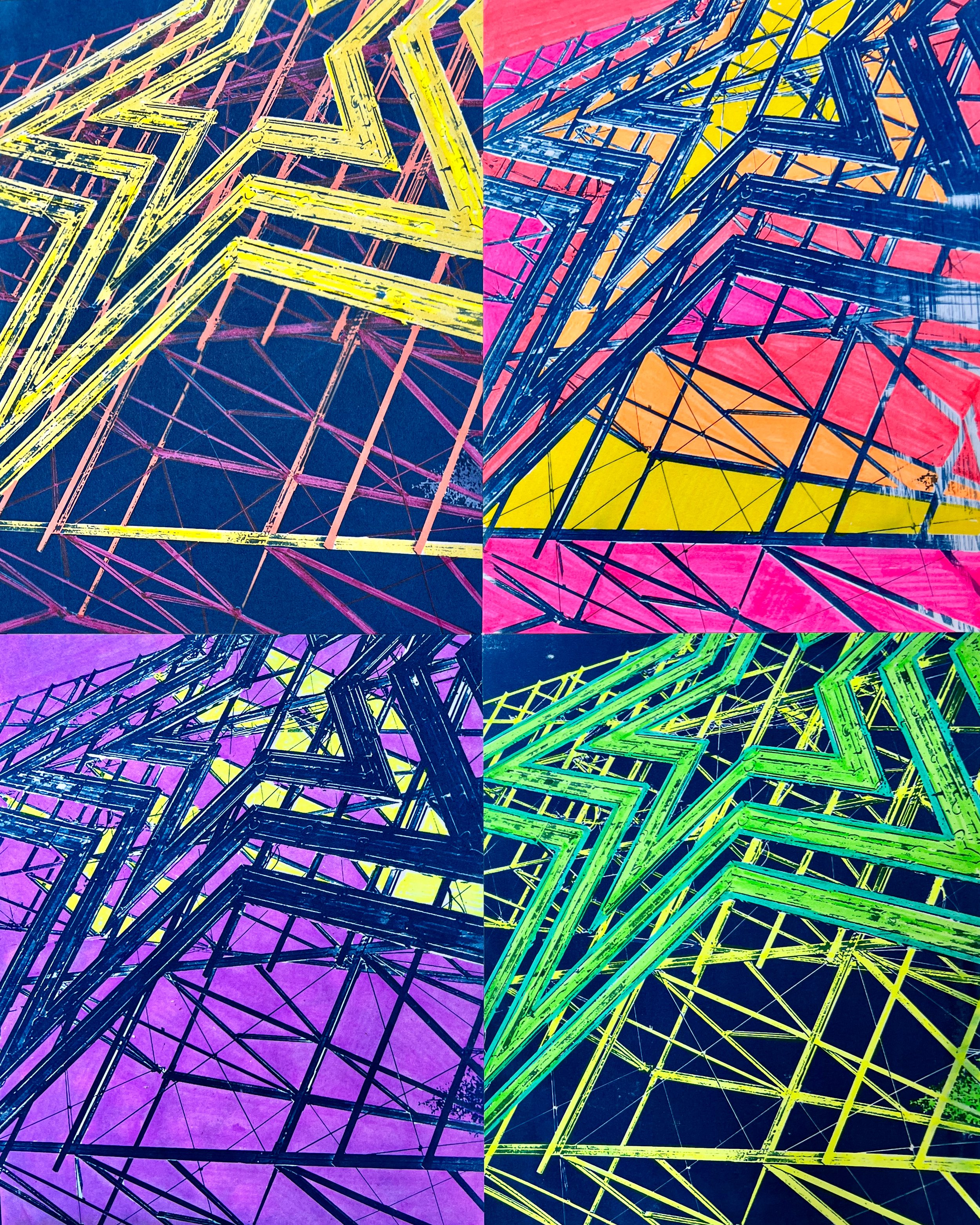
The COLOR STUDIES series of images uses traditional cyanotypes that are hand-colored with highlighter pens- everyday office supplies. Highlighters are designed to call attention to something to be remembered. The color directs the viewers’ attention to certain areas of the image, whether it is the foreground, the background, or the spaces in between. Here manipulation of the image is not subtle as in traditional hand-coloring of photographs.


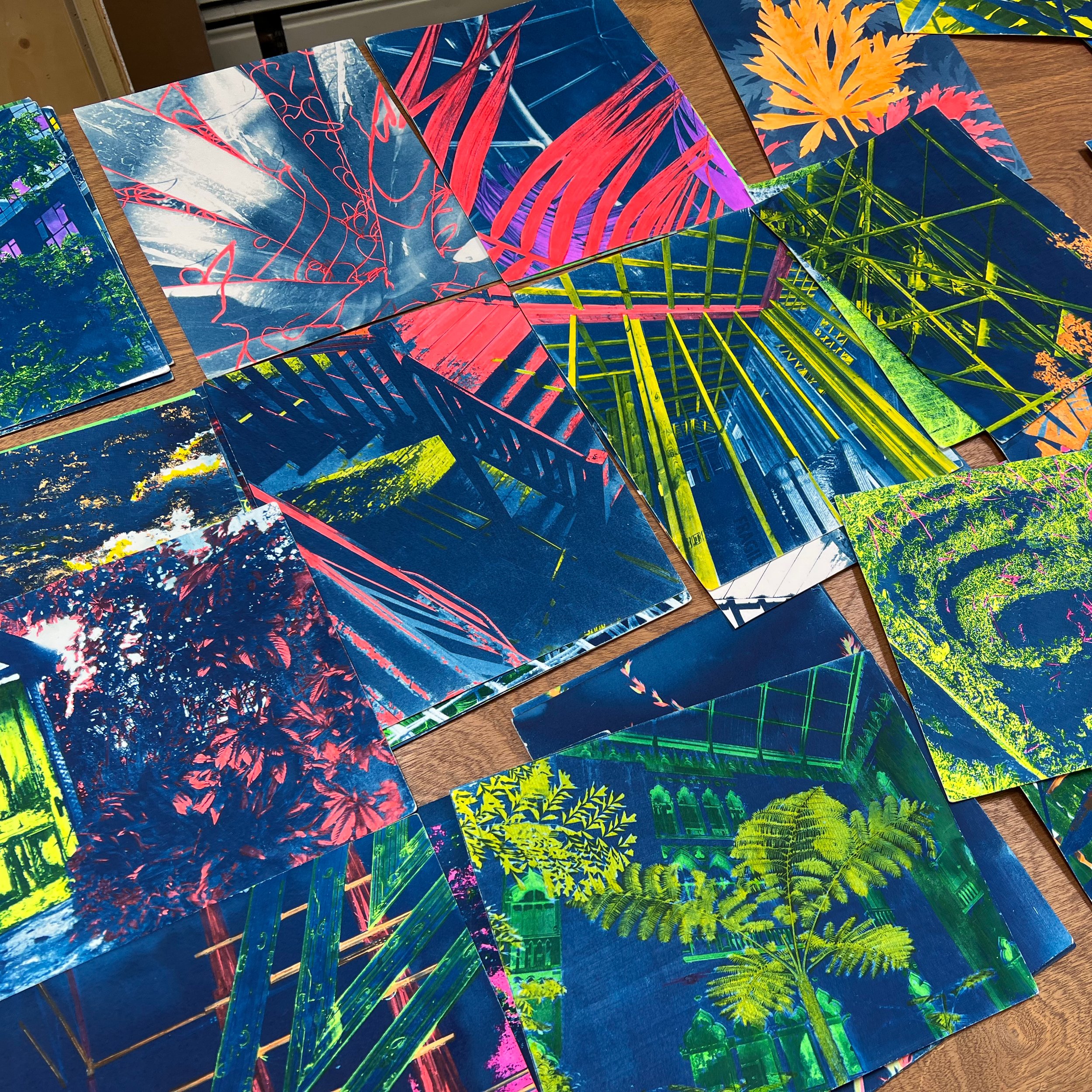
The initial choice of highlighter was random. Driven by a desire to add color to the cyanotype, disappointed with the dull muddy images produced by toning cyanotypes and faced with a limited selection of materials, I tried fluorescent color and loved the result. Highlighters have unique properties. The neon, transparent color allows the image beneath to show through. It seeps into the paper, whereas paint, no matter how translucent, sits on top.

From an archival standpoint, neon colors in general and highlighters in particular, are fugitive colors, pigments that are less permanent when exposed to environmental factors. Using color that is essentially temporary is intentional. This work leans into he notion of impermanence. The photos were created spontaneously in a spirit of play. The images were chosen at random for this series, simply because they might be interesting with the addition of color. It’s not about what the images represent so much as it is about the bold color and graphic nature of the resulting image. Colors were chosen purposefully to be unnatural-maybe a little lurid, a little ominous, artificial.

Much of my work as a whole deals with the idea of what remains, but permanence is not necessarily an indication of quality or of value.  What endures is largely a result of chance. Mundane things get kept, passed on, and precious things (and people) are lost forever. Who decides what is ‘worthy ‘of preservation? COLOR STUDIES are intentionally ephemeral; there is no pretense that they are archival. They are impermanent, like everything. Life has shown us starkly in the last few years- climate change, pandemic, war, shootings- that we can lose who/what we value at any time. The bright intensity of color, the attention to the construction of the image, and the fleeting quality of the materials in this series acknowledges temporality and celebrates the now.

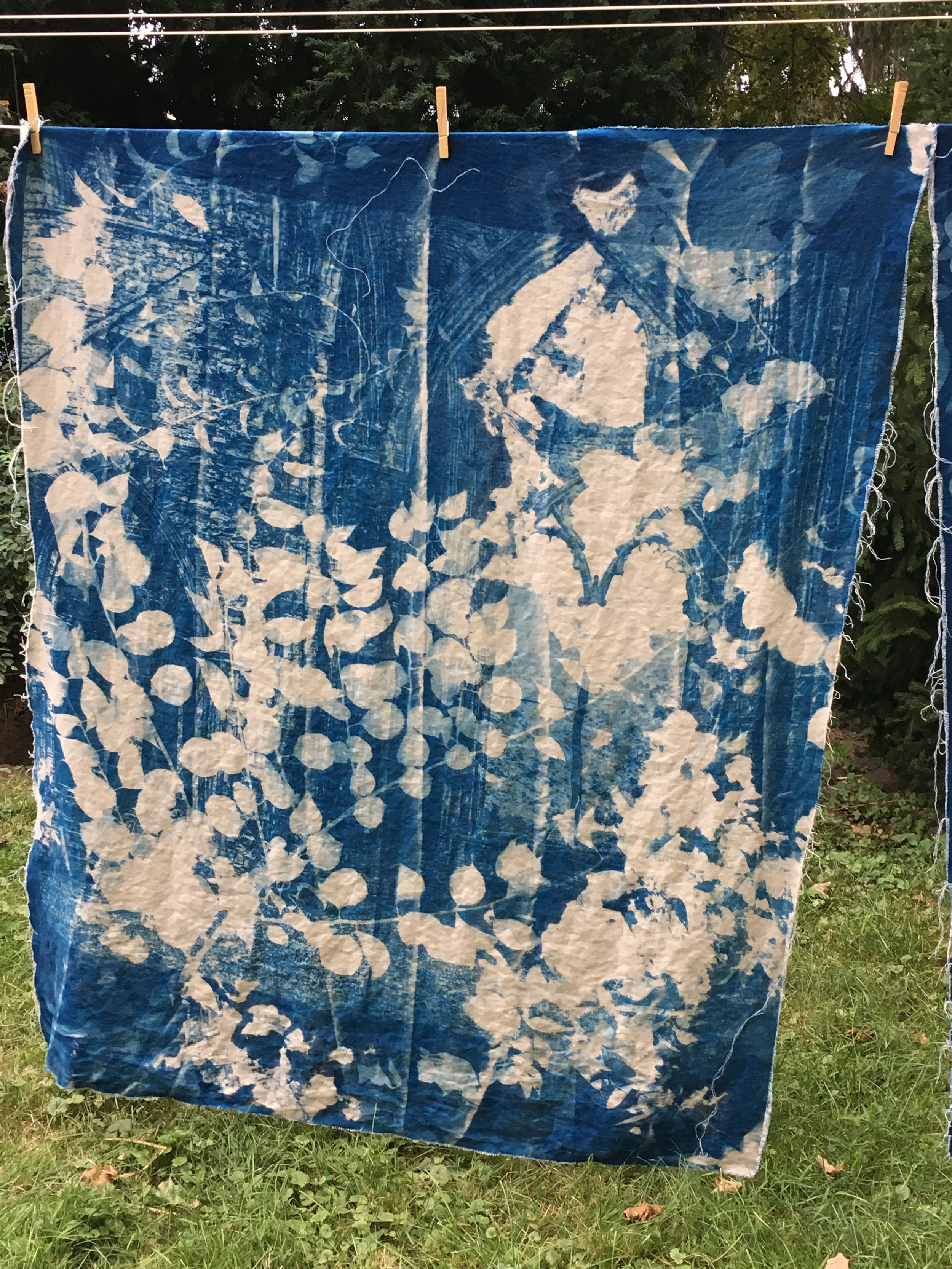
“We All Shine On” cyanotype and highlighter, 16 x 20 inches


C Clinton
Natural Consequences- Embracing Ambiguity

Natural Consequences,’ an installation, explores our tendency and need to interpret our surroundings to reconcile our relationship between the natural world, with its own laws and trajectories, and our industrial human-constructed world. This piece, composed of numerous panels of transparent silk organza, each 48 inches high and between 60 and 96 inches long, can be up to 25 feet long and can be reconfigured to different lengths. It is suspended in such a way as to allow for overlap of the panels. Additionally, photographs of the sheer cyanotypes in the environment provide context.

Marie Craig's "Natural Consequences" -cyanotypes on silk floating in nature reveal the landscape beyond. FIlmed in Saguaro National Park, Arizona.


Multiple large panels of transparent silk organza are printed using Cyanotype, a primitive photographic process that embraces nature’s unpredictability and allows both choice and chance to factor into the outcome of each panel.

Large negatives were placed onto sheer silk organza fabric that had been coated with cyanotype chemicals, and exposed in the sun.

Large negatives were placed onto sheer silk organza fabric that had been coated with cyanotype chemicals, and exposed in the sun.

The exposed fabric was developed and rinsed with water, in shade, using my patented “3-bucket method.”

The exposed fabric was developed and rinsed with water, in shade, using my patented “3-bucket method.”

Cyanotype is just about the most eco-friendly photographic process there is, no harm came to this glorious desert landscape.

Cyanotype is just about the most eco-friendly photographic process there is, no harm came to this glorious desert landscape.

Watching the cyanotypes billow as they dried in the breeze was mesmerizing, leading me to look for ways to recreate this feeling “in captivity” so to speak, indoors in a gallery setting.

Watching the cyanotypes billow as they dried in the breeze was mesmerizing, leading me to look for ways to recreate this feeling “in captivity” so to speak, indoors in a gallery setting.

The resulting blue images, delicate and transparent, are overlapped, conjuring recognition, juxtaposition, blending, new synthesis, and deeper understanding. Images from our collective memories, such as nature, industry and natural disaster, exist together, bringing forth ideas of nature’s power and resilience. Photographs of the panels existing within the landscape, billowing with the wind and affected by the elements invite a conversation with the landscape that surrounds the piece, and the delicate balance of its stability and its disequilibrium. There is an erosion of narrative through the obscuring of one image with the overlap of another; nothing is clear, straightforward, or easy. Multiple realities coexist, and distinct facts, locations, paradigms or viewpoints begin to be inextricable from their counterpoints.  Observing the analytical process, left with the flow, results in an awareness that perception is nuanced, fluid and shifting, grounded in historical context, and continually shaped new by information.  Life itself is an ongoing collage, drawing from a reservoir of memory, interpretation, imagination.

Our senses are bombarded by stimuli, and our brains work to knit disparate elements together, filtered through historical context into one continuing story.  When facing complex problems and situations, whether personal or global, reaching beyond the obvious allows us to see how disparate realms that are at odds with one another are inextricably intertwined.  Our capacity for discernment can take us beyond simple observation toward novel ideas and creative solutions that may help us restore balance between them.  Ambiguity is a way to perceive connectedness, understand varying perspectives and imagine alternative possibilities. Creativity in the face of adversity generates resilience.


About cyanotype-

Cyanotype is an antique photographic process distinctive for its Prussian blue monochrome prints. It was invented by English scientist and astronomer Sir John Herschel in 1842. A year later, Anna Atkins, an amateur scientist, used the process to create a limited series of cyanotype books that documented ferns and other plant life; she is regarded as the first person to publish a book of photographs. As photography improved, cyanotype fell out of favor, surviving as a copying technique for documents and plans in the form of blueprints. Fascination with early or alternative photographic techniques has led to a renewed interest in cyanotype, as it is easy to master and eco-friendly. The chemicals can be applied to a variety of surfaces and exposed in contact with an object or negative either directly to the sun or to an artificial ultra violet light source. Development simply involves washing with water and allowing to dry naturally.

C Clinton
Why Cyanotype?

For me, Juncture refers to a turning point, the place where the choice you make profoundly alters the trajectory of what follows, whether you know it at the time or not. The work I do using cyanotype exploits that concept, since chance is a huge factor in the outcome of the piece.


I started making cyanotypes of plant life a few years back, while traveling in Australia, my second home. I couldn’t take eucalyptus leaves home with me (plant material can’t be brought back into the country), and ordinary photos couldn’t capture the intimacy and emotion the shapes brought to me. But the cyanotypes did.

first tries - 1.jpg


During an artist residency at BigCi, in the Blue Mountains west of Sydney, Australia, I began to layer the leaves, with their iconic, organic shapes, over digital ‘negatives’ of evidence of man- street signs, buildings, ruins.  The unique combinations, overlapping and obscuring one another, were visually striking.

more from bilpin - 1.jpg

Using linen was at first a technical solution to the problem of rinsing large pieces of paper, and I saw huge advantages- the ability to create much larger works this way, not to mention the beautiful texture of the linen surface and the fluid nature of the final presentation.

works on linen - 1.jpg


It occurs to me that the making of my art is completely and inextricably wrapped around my daily life. I coat paper and fabric with photo-sensitive solutions in my basement, and leave them there in the dark to dry.

coating the paper - 1.jpg

I wrap the coated paper in heavy black garbage bags, and wait for a sunny, windless afternoon.  Then I cut weeds from my garden, and expose the paper on my back deck. Or I fill my car with 7 ft. negatives and a trunk full of yard waste, and drive over to the loading dock of my studio building, where I expose those big guys.


Then back in the garbage bags, back home, where I rinse them in the bathtub, then the washer and dryer, and hang them on the clothesline to get a good view- the first time I actually see the final result.

Craig cyanotype process  - 1.jpg
Craig cyanotype process  - 5.jpg


My process is controlled chaos. Experience has taught me the parameters and limits of the technique, and how best to manipulate the negative, the plant material, the exposures, etc. But season, sun and wind work their own magic, and play at least as big a part in the process. I love allowing chance and the weather to be a partner in the process.


Behind the obvious visual excitement I feel when I see the striking blue color and the relationships of the organic shapes intertwined with architecture, I think about the push and pull of human impact on the world with the untamed wildness of nature. In this tug of war, it seems sometimes as though man subjugates his environment, but nature is powerful, persistent, and resilient. It continues to exert its presence despite efforts by us to impose order and control. In effect my process lets go of that order and control, and the work is created in partnership with nature.


Cyanotype is an early photographic technique, invented in 1842. People are often familiar with it from architectural blueprints, or those solar-prints many of us played with as kids. The first known female photographer, Anna Atkins, used this process to create an illustrated book of photograms of plants. In the 19th and early 20th centuries, travel photographers often used cyanotype to make prints when they were away from their darkrooms. My first experiments with cyanotype were with plants, while traveling. A perfect fit, although I didn't realize why at the time.


Today, the technique is enjoying resurgence, because it’s easy, eco-friendly, analog in nature.


Google it. Try it. It’s fun!

C Clinton
Around the Curve...or, the Story of the Sidewalk Chairs

Back in the summer of 2007, I began to notice a little slice of life sitting on the curb. The many chairs left out on the sidewalk grabbed my attention. I did not seek them out, but came upon them while crossing the neighborhoods on my many errands. I looked twice, stopped, and photographed. I made myself some rules. Only chairs. Only on the side of the road. I asked friends and strangers to notice, and call me. They did!

Marie Craig .jpg

The project became a bit of an obsession; much more than just a collection of images for me. I started to call the project ‘Rocker on Curve’, in honor of the one that got away. Three words, left for me on a post-it note by one of my ‘spotters’. By the time I got there, the chair was gone!

Whenever I found myself taking a second look, I was surprised by unexpected color, light and texture. Each chair had so many secrets. Whose was it? Where was it before? Why would someone throw that away? Or conversely, why did anyone hang onto that awful thing for so long? Did it start out ugly, or did it just get that way? Was it loved? Abused? Both? I found myself thinking of the person who once sat and read the paper in that chair, snuggled with a little one and a bedtime story, or fell asleep in front of the TV.

The chair also tells a story of consumption, serving as a metaphor for the many things we admit into our homes. The things we acquire have value and purpose. They are incorporated into our lives, become the setting for the drama that is home and family.

Over time that fine new chair becomes invisible. It scratches, sags, splinters. Eventually we tire of it, and it’s time to acquire again. The fate of the sidewalk chairs reminds me of what happens to all our stuff once it gets worn and tired.

When it hits the curb, the chair is at a turning point. As it takes a slow journey from the living room to the family room to the basement to the garage to the street, sometimes it gets a reprieve as someone’s bargain or craft project, or it gets scavenged and becomes part of a college student’s experiment with independence.

I wonder, what happens next?

C Clinton
Vantage Point

Why do I take pictures of busted windows and creepy abandoned places and things? Because of the vigor and life these things once had. Because somebody spent hours every day for years looking out that window, sitting in that chair. Because time is unstoppable, memory is fleeting, and life goes on. But I am here now, witness to the march of progress.

Progress Road, 24x24 in., archival photo on aluminum.

Progress Road, 24x24 in., archival photo on aluminum.


The photographs in this series have been taken all over the world- Australia, China, around the corner (in this very room) … which is curious, because geography is not central here. What is pivotal, what makes me make the photograph, is the ‘hey, wait a minute’ second look– something’s ambiguous, not quite right. The vantage point is often unclear; multiple perspectives and layers compete for attention, The eye is attracted by color and shape, the brain sticks around because something’s incongruous, not easily digested.


All of these images were composed within the camera, not constructed with image editing software (although global enhancements were made) In many cases the final photograph is a dye sublimation print on aluminum, a process whereby the image is infused into the aluminum surface and not onto it, giving it an almost magical luminescence. I’ve chosen a high gloss surface specifically because its reflective quality will add another dimension, that of the viewer and his surroundings.


My camera records evidence of the juncture between the past and the present.


My photographs bring together the present and the future.


My intent is to call to mind an awareness of the transience of life and our place in the world.

C Clinton